Handmade in York, PA — Each Piece One of a Kind
5 min read
·
Steelers vs Eagles is not just a football rivalry in Pennsylvania. It is a cultural divide. And York, PA sits right on the fault line. Drive 90 minutes west and you are in Steelers country. Drive 90 minutes east and you are in Eagles territory. My studio is planted squarely in the middle of it, which means I dye both palettes constantly, and I have strong opinions about how each one behaves in ice dye.
Both Steelers ice dye and Eagles ice dye are among my most-ordered team colorways. They could not be more different in how they look, how they react chemically, and what kind of energy they bring to a finished piece. If you are a PA football fan (or if you just appreciate color), here is how the state's two biggest NFL palettes stack up on fabric.

The Steelers palette is Steelers Gold (#FFB612) and Steelers Black (#101820). Two colors. Maximum contrast. Zero subtlety. That is Pittsburgh in a nutshell, and it translates perfectly into ice dye.
The gold Procion MX I use for Steelers pieces is a bright, saturated yellow-gold that commands attention the moment you see it. Under ice, it splits into warm components ranging from pale butter yellow at the lightest edges to deep marigold in the concentrated areas where dye pooled during the melt. It is one of those dyes that always looks rich and deliberate, even in the unpredictable ice dye process.
Black provides the counterweight. Procion MX black is not a simple single pigment. It is actually a blend of navy, dark green, and brown pigments. Under ice, those components occasionally separate, revealing unexpected warm brown and dark navy undertones that pair beautifully with the gold. The black areas of a Steelers piece have depth that you would never get from a flat-printed black.
The transition zones are where Steelers pieces really shine. Where gold and black meet on the fabric, the ice melt produces rich amber, bronze, and dark honey tones that feel like a Pittsburgh sunset over the Allegheny River. I typically use a crumple technique with heavy gold application and strategic black placement. The goal is a piece where the gold leads, bright and unapologetic, with black providing drama in the creases and valleys.
As a fellow Pennsylvanian, Steelers pieces get extra care in my studio. The black-and-gold energy of this palette is iconic, and I want every piece to do justice to what those colors represent.
The Eagles palette is Midnight Green (#004C54), Eagles Silver (#A5ACAF), and Eagles Black (#000000). Where the Steelers go bold and warm, the Eagles go cool and mysterious. Midnight green is a color no other team in the NFL uses, and it behaves unlike any other color in my dye cabinet.
Midnight green is a deep teal, a compound color containing both blue and green pigments. Under ice, those components separate in ways that are breathtaking. From a single dye application, you will see dark forest green, deep teal, bright emerald, and hints of turquoise all emerging across the fabric. The range of tones that a single midnight green dye produces is wider than most two-color palettes. It is a color that was made for ice dye.
The silver is created through controlled negative space. I leave areas of the blank with minimal dye coverage, letting the natural gray of the Comfort Colors blank serve as the metallic accent. Where the midnight green fades to its lightest, you get a natural gradient from deep green through seafoam to silver-gray that looks like it was planned even though the ice created it on its own.
Black provides depth in the deepest folds and creases, preventing the piece from becoming too bright. I use a tight crumple that creates lots of small texture variations, letting the midnight green display its full range. Eagles pieces have a sophistication and tonal complexity that makes them some of my favorite work. As a Pennsylvania dyer, this colorway is personal, and these are consistently among my best sellers, especially during playoff season.

Contrast level. Steelers is extreme contrast: black and bright gold sitting right next to each other with dramatic boundaries. Eagles is more gradient-driven. The midnight green flows through a huge range of tones before reaching black, with silver serving as a subtle middle ground. If you like bold and graphic, you lean Steelers. If you like depth and complexity, you lean Eagles.
Color temperature. Steelers is a warm palette. Gold is warm. The amber and bronze transitions are warm. Even the black reveals warm brown undertones. The whole piece radiates energy. Eagles is a cool palette. Teal is cool. The emerald and turquoise tones are cool. Even the silver has a cool, steely quality. An Eagles piece feels calm and sophisticated where a Steelers piece feels loud and confident.
Pigment splitting. This is where the Eagles palette actually has an edge in terms of pure dye chemistry interest. Midnight green is a compound color that splits into 4 or 5 distinguishable tones from a single application. Steelers gold is vibrant but stays within the yellow-amber family. Both are beautiful, but midnight green produces a wider color story on fabric.
Wearability. Both palettes produce pieces that people reach for constantly. Steelers black and gold works with jeans, black pants, and casual outfits. Eagles midnight green and silver has a slightly more distinctive look that pairs well with neutral wardrobes. Neither is a closet-sitter — both get worn.
I do not pick sides in the Steelers-Eagles debate. I live in York. I value my relationships with customers on both sides of the Susquehanna. But I will say this: both palettes are in my top five favorite NFL colorways to dye, and for completely different reasons. Steelers gives me high-contrast drama and warm, golden energy. Eagles gives me tonal depth and cool, sophisticated complexity. My studio produces both with equal pride and equal care.
If you want to see the full color breakdowns and dye technique notes for each team, check out the Steelers team color page and the Eagles team color page on our site. Or browse all 32 NFL palettes on the team colors hub.
And if you are one of those rare York County fans who roots for both teams, or who wants to dye-off with a friend (one piece in each palette), I am here for it. Reach out through the preorders collection and let me know your team. I will make sure the colors do it justice.
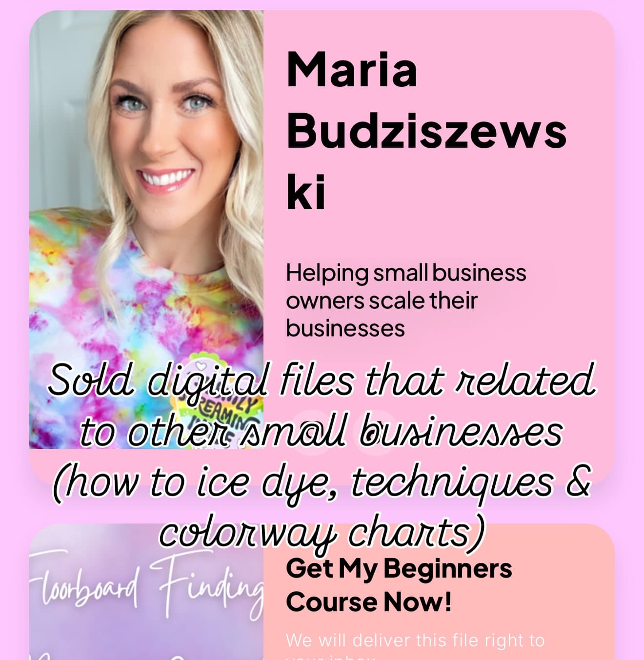
Maria Budziszewski
Owner & Creator
Every piece is hand-dyed with care in York, PA. From ice dye hoodies to crystal jewelry, each item is crafted to be one-of-a-kind.
Meet the creator →Love what you see?
Shop our handmade ice dye apparel, graphic tees, and crystal jewelry.
Browse CollectionsMore from the Journal
 Team Colors
September 1, 2026
Maria Budziszewski
·11 min read
Mass-produced fan gear all looks the same. NFL team color ice dye gives you a one-of-a-kind piece dyed by hand in your team's actual color palette — wearable art that stands out in every stadium.
 Team Colors
September 15, 2026
Maria Budziszewski
·8 min read
College team color ice dye transforms your school's palette into one-of-a-kind wearable art. From Penn State's navy to Michigan's maize and blue, here is how your team's colors come alive in ice dye.
 Team Colors
March 1, 2027
Maria Budziszewski
·6 min read
Spring is the season when ice dye color palettes shift. Here are the pastel, earth tone, and bold colorways I am dyeing this spring, plus how to pair them with crystal jewelry for a complete look.
